Using bundling to generate base64 encoded images in CSS

9. juni 2013 14:59 by martijn in .net, bundling, css

Should I use base64?


In this era of optimization and mobilization having a lot of request to load your website is considered a bad thing. One of the things you can do is 'inline' your images in your CSS file using a base64 format. This way the browser can get the CSS and the images in one big request.

There are some cons to this :

  • Images are not cached separately and when you change your css the download will be bigger.
  • IE6 and IE7 don't support base64 images in CSS. You can use a fallback tag for these browsers.
  • Your development gets more complex as you have to remember to update the base64 images in your css when you modify an image.
  • Images in css are about 37% larger than in a separate file.
  • Works for images up to 37k in IE8
  • Stylesheets get really large 

Also you might consider using a spritesheet which can be cached seperately (like jQuery UI does for example) or create a separate stylesheet for your inlined-images so your cache will not be invalidated when you change something else in you stylesheet. Some more considerations and opinions at Stackoverflow....

Creating a bundle transform to inline the images

So still interested? Some of the development disadvantages can be avoided by using a bundle transform. A bundle transform is part of the System.Web.Optimization library by Microsoft. The basic idea of bundling is combining multiple css or jss files into one big file at runtime. You can configure System.Web.Optimization to only optimize when you are in release mode so that during development you have separate readably resources. This post is about creating a bundle that replaces background-image:url('/yourimage') which base64 urls during optimization.

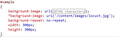
As you can see the image is inlined (in the 28796 characters) and a fallback for IE6/IE7 is supplied as well. 

This can be done at development time easily with the web essentials extension by Mads Kristensen. The idea of this transform is to perform the operation at runtime. The main advantage is that your development is not cluttered with having to regenerate images and having optimization only on production code.

Here's the code

So let's get into the details. Sorry for the missing syntax highlighting. I have not fixed that yet.

[code:c#]

 public class CssBaseEncodeTransform : IBundleTransform

    {

        public void Process(BundleContext context, BundleResponse response)

        {

            response.Content = InlineBase64BackgroundImages(response.Content, BundleTable.MapPathMethod);

        }


        public static string InlineBase64BackgroundImages(string content, Func<string, string> mappath)

        {

            //find background-images


            var parser = new CSSParser();

            var cssDocument = parser.ParseText(content);

            foreach (RuleSet rule in cssDocument.RuleSets)

            {

                var declarations = rule.Declarations.ToList();

                foreach (var declaration in declarations)

                {

                    if (declaration.Name == "background-image")

                    {

                        rule.Declarations.Add(GetIe6Declaration(declaration));

                        EmbedUrlInBackground(declaration,mappath);

                    }

                }

            }


            return cssDocument.ToString();

        }


        private static Declaration GetIe6Declaration(Declaration declaration)

        {

            var copy = new Declaration();

            copy.Expression = new Expression()

                {

                    Terms = new List<Term>{new Term() {Value = declaration.Expression.Terms.First().Value}}

                };

            copy.Name = "*background-image";

            return copy;

        }


        private static void EmbedUrlInBackground(Declaration declaration, Func<string, string> mappath)

        {

            var imageUrl = declaration.Expression.Terms[0].Value;

            var image = Image.FromFile(Path.GetFullPath(mappath(imageUrl)));

            var data = ImageToBase64(image, ImageFormat.Jpeg);

            var url = string.Format(@"data:image/jpg;base64,{0}", data);


            declaration.Expression.Terms[0].Value = url;

        }


        public static string ImageToBase64(Image image,ImageFormat format)

        {

            using (MemoryStream ms = new MemoryStream())

            {

                // Convert Image to byte[]

                image.Save(ms, format);

                byte[] imageBytes = ms.ToArray();


                // Convert byte[] to Base64 String

                string base64String = Convert.ToBase64String(imageBytes);

                return base64String;

            }

        }

    }

[code]

  1. The code basically looks for background-image declarations in your style sheet.
  2. If found replace the url('/image') with the base64 equivalent.
  3. A *background-image declaration is added for IE6/7 support.

Usage

Just add the transform to the bundle :

The code use the simple css parser project which can be found here (and is included in the zip). The source code is also included at the bottom. Hope is this of some use or inspiration!

Base64Bundling.zip (997.47 kb)


Creating a three column responsive layout with one fixed and two fluid columns

4. juni 2013 20:33 by martijn in css, design, html, responsive

Today I want to give a sample of a way you can create a semi-fluid layout. By semi-fluid I mean some columns in your layout have a fixed size and others work with percentages. This is especially usefull if you are doing responsive design. The finished demo can be found here


Html Structure

The basic sample consist of the following html:


    <div class="wrapper">
        <aside>           
        </aside>
        <div class="col1">           
        </div>
        <div class="col2">           
        </div>
    </div>
 
We have a wrapper div that contains all three columns, we have a aside for our left or right column. In this sample I will place it left. There is a column in the middle taking up 2/3 of the width for our main content. And a column on the right taking up the remaining 1/3. 
 

Positioning with border box and padding

To positions the divs next to other we use a float left and give percentages of 66% and 33%. If we then give a fixed width to the aside you will find that the wrapper is wider than the 100% that 66 + 33 is supposed to be. This is because the width of the aside is not substracted before the percentages are calculated. One way to work-around this is by using the border-box css property and some padding on our wrapper div. By setting a padding-left on the wrapper we create a space of absolute position which is not included in our 100% when we use 'border-box' sizing on our wrapper. To read more about 'border-box' I recommend the post by Paul Irish on this topic Now we have a empty padding space we can move in the aside by giving that an absolute position of 0,0 and a relative position on the wrapper. That way the aside is always in the top left corner of the wrapper. See this first step here
 

Adding some responsiveness

In a responsive design you might want remove the aside and replace it with a toggle menu or some other element. Removing the aside is easy : all we have to is set its display to none and remove the padding from the wrapper so our remaining columns can take the full 100%. We do this when the screen gets below a certain width in a media query :
        
        @media screen and (max-width: 700px)
        {
            aside
            {
                display: none;
            }
 
            .wrapper
            {
                padding-left: 0;
            }
        }
 
When we use an even smaller device we might even prefer a single colum layout. In order to do this we simply give our columns the full 100% width below some screen width in a another media query:
 
        @media screen and (max-width: 500px)
        {
            .col1, .col2
            {
                width: 100%;
            }          
        }
 
This step can be seen here

Adding some fancyness

To really top it off we might want to animate the removal the side bar by sliding it off to the left. This is easy to do with a CSS transition. Support for this is still limited though now (no IE9 but IE10 is OK) so i would stick with a jQuery sollution for production environments. To slide we animate both the 'padding of the wrapper and the left property of the aside. The aside moves of the screen as the padding gets smaller creating a nice effect.
        .wrapper
        {
            transition: padding 0.5s;
        }
 
        aside
        {
            transition: left 0.5s; 
        }
 
Now in a media query we change both the padding and left.
        @media screen and (max-width: 700px)
        {
            aside
            {
                left: -200px;
                
            }
 
            .wrapper
            {
                padding-left: 0;
            }
        }
 
The final demo is here
I hope this is off some use to you!