Today I want to give a sample of a way you can create a semi-fluid layout. By semi-fluid I mean some columns in your layout have a fixed size and others work with percentages. This is especially usefull if you are doing responsive design. The finished demo can be found here.
Html Structure
The basic sample consist of the following html:
<div class="wrapper">
<aside>
</aside>
<div class="col1">
</div>
<div class="col2">
</div>
</div>
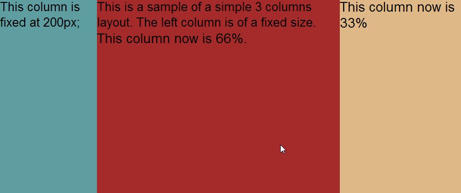
We have a wrapper div that contains all three columns, we have a aside for our left or right column. In this sample I will place it left. There is a column in the middle taking up 2/3 of the width for our main content. And a column on the right taking up the remaining 1/3.
Positioning with border box and padding
To positions the divs next to other we use a float left and give percentages of 66% and 33%. If we then give a fixed width to the aside you will find that the wrapper is wider than the 100% that 66 + 33 is supposed to be. This is because the width of the aside is not substracted before the percentages are calculated. One way to work-around this is by using the border-box css property and some padding on our wrapper div. By setting a padding-left on the wrapper we create a space of absolute position which is not included in our 100% when we use 'border-box' sizing on our wrapper. To read more about 'border-box' I recommend
the post by Paul Irish on this topic Now we have a empty padding space we can move in the aside by giving that an absolute position of 0,0 and a relative position on the wrapper. That way the aside is always in the top left corner of the wrapper. See this first step
here
Adding some responsiveness
In a responsive design you might want remove the aside and replace it with a toggle menu or some other element. Removing the aside is easy : all we have to is set its display to none and remove the padding from the wrapper so our remaining columns can take the full 100%. We do this when the screen gets below a certain width in a media query :
@media screen and (max-width: 700px)
{
aside
{
display: none;
}
.wrapper
{
padding-left: 0;
}
}
When we use an even smaller device we might even prefer a single colum layout. In order to do this we simply give our columns the full 100% width below some screen width in a another media query:
@media screen and (max-width: 500px)
{
.col1, .col2
{
width: 100%;
}
}
This step can be seen
hereAdding some fancyness
To really top it off we might want to animate the removal the side bar by sliding it off to the left. This is easy to do with a CSS transition. Support for this is still limited though now (no IE9 but IE10 is OK) so i would stick with a jQuery sollution for production environments. To slide we animate both the 'padding of the wrapper and the left property of the aside. The aside moves of the screen as the padding gets smaller creating a nice effect.
.wrapper
{
transition: padding 0.5s;
}
aside
{
transition: left 0.5s;
}
Now in a media query we change both the padding and left.
@media screen and (max-width: 700px)
{
aside
{
left: -200px;
}
.wrapper
{
padding-left: 0;
}
}
I hope this is off some use to you!